EasyLift Carpooling.
A carpooling app with focus on accessibility

THE CASE AT A GLANCE
A carpooling app with focus on accessibility
Making ride sharing accessible and easy to navigate, focusing on clarity, usability, and age-inclusive design. This concept was developed during a one-week UX design sprint as part of my UX program, focusing on rapid research, accessibility considerations, and iterative prototyping.
UX/UI Design · Accessibility-focused UX Research · Interaction Design
PROJECT
Easylift – Accessible carpooling for everyday mobility
CONTEXT
UX Program Sprint Project
SECTOR
Mobility · Accessibility · Social Impact
CHALLENGE
Carpooling apps are often difficult for older users to navigate, especially users with visual limitations.
MY ROLE
UX/UI Designer & Accessibility Lead
FOCUS
UX · User Research · Accessibility · Interaction Design
TIMELINE
1 week
TOOLS
Figma · Figjam · Miro · Adobe Creative Suite
MY ROLE
UX Designer
- Led research synthesis and defined the core problem
- Designed the end-to-end user flow for onboarding and ride matching
- Created wireframes and interactive prototypes
- Translated usability insights into iterative design improvements
UI/Visual Designer
- Defined visual hierarchy and accessibility principles
- Designed clear, readable interface layouts
- Refined interaction feedback and microcopy
- Ensured visual elements supported accessibility and usability
Challenge & Research
In areas with limited public transportation, many older adults rely on others for essential travel such as grocery shopping or medical appointments. At the same time, many drivers travel with empty seats.
To understand the needs of this group, we developed a persona representing an older adult with reduced vision and limited digital experience. This persona helped guide design decisions around accessibility, navigation, and cognitive load.
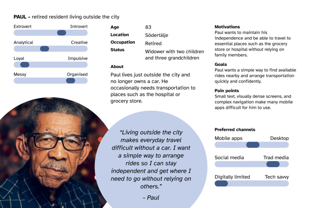
The challenge was to design a mobile experience connecting drivers with available seats and older adults needing transportation, while remaining accessible to users with visual impairments or reduced dexterity.
Research focused on accessibility principles, mobile usability for older adults, and age-related changes affecting perception and interaction. These insights shaped the overall design direction for the product.
Key design considerations included:
- Larger touch targets and simplified interactions
- Clear visual hierarchy and readable typography
- Avoiding clutter and reducing cognitive load
- Supporting accessibility features such as screen readers and text scaling
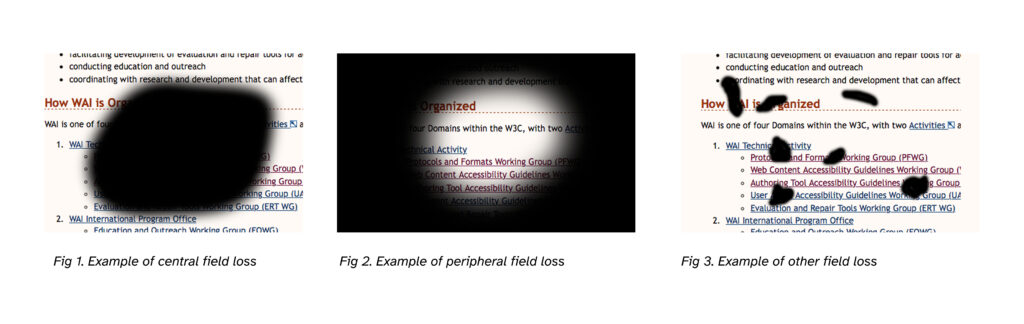
During our research, we examined how users with visual impairments
may experience different types of vision loss.
Key Insights
Research and usability observations revealed friction points in how older adults interact with digital interfaces.
While many are comfortable using smartphones and everyday apps, common design patterns — such as dense layouts, small touch targets, and unclear navigation — increase cognitive effort and reduce confidence.
The key insights below summarize the most consistent patterns observed during the research:

Accessibility barriers
Older users may struggle with small touch targets, dense layouts, and unclear navigation patterns.
Cognitive load
Too much information on a single screen quickly becomes overwhelming.
Clarity over efficiency
Users value clear feedback and predictable flows more than speed.
Trust and simplicity
Older adults are more likely to adopt new technology when interactions feel structured, predictable, and easy to understand.
Core Insight
A key realisation emerged during the research. Designing for clarity benefits all users, but it is essential for people with visual limitations or limited digital experience.
True accessibility isn’t just compliance — it’s designing interactions that are clear, predictable, and effortless to use.
This made us pose a couple of HMV-questions with the top one being: “How might we design a carpooling app that remains accessible and easy to use for older adults with both cognitive and visual limitations?”
“How might we design a carpooling app that remains accessible and easy to use for older adults with both cognitive and visual limitations?”
Concept
Instead of presenting multiple tasks at once, the interface guides users step-by-step through a clear journey. The goal was to minimize cognitive load and allow users to focus on one decision at a time:
Create account → Add personal details → Enter travel information → Find rides.
Key design principles included:
- One primary action per screen
- Large, clearly labelled buttons
- Icons always paired with text labels
- Clear feedback after each interaction
- A consistent, predictable layout
The Easylift concept focuses on progressive interaction and visual simplicity.

Prototype & Usability Testing
Low-fidelity wireframes and a clickable prototype were created to test the core user flow — the steps users take to create an account, enter travel details, and find a ride.

A usability test scenario was conducted with participants acting as an elderly user who needed transportation to places such as the hospital or grocery store.
Testing showed that the overall flow was intuitive, but several areas needed refinement. These insights informed several design iterations.
Key feedback included:
- Some screens contained too much information at once
- Password help indicators were too small
- The interface benefited from clearer focus states


Findings
After the usability testing sessions, key usability issues and opportunities for improvement were identified.
Several participants noted that some screens felt visually dense, particularly during the account creation process. For users with reduced vision or limited digital experience, this increased cognitive load and made it harder to focus on the task.
Other observations included:
- Password guidance icons were too small to be clearly visible
- Some supporting information appeared too early in the flow
- Visual hierarchy could be improved to guide attention
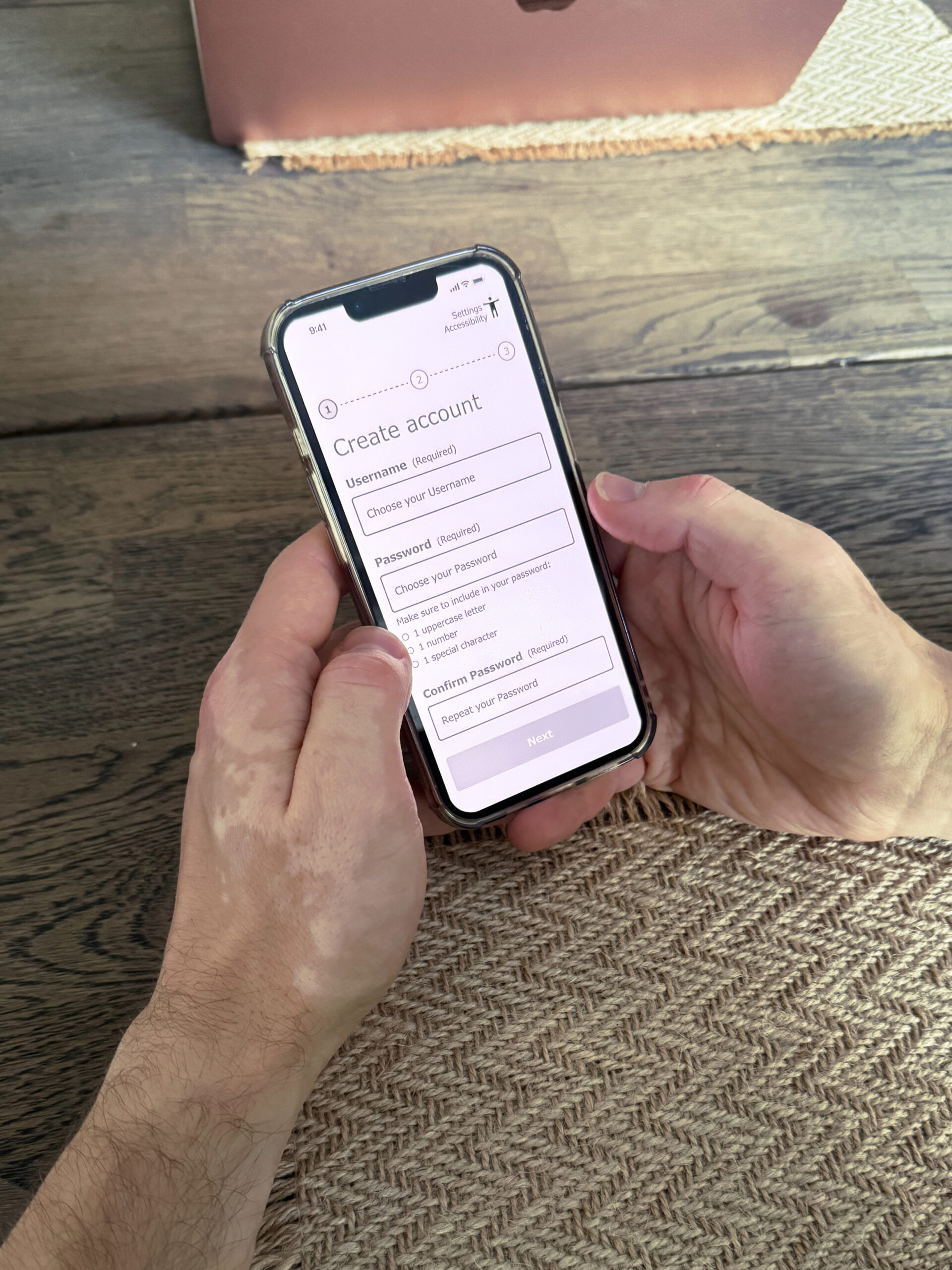
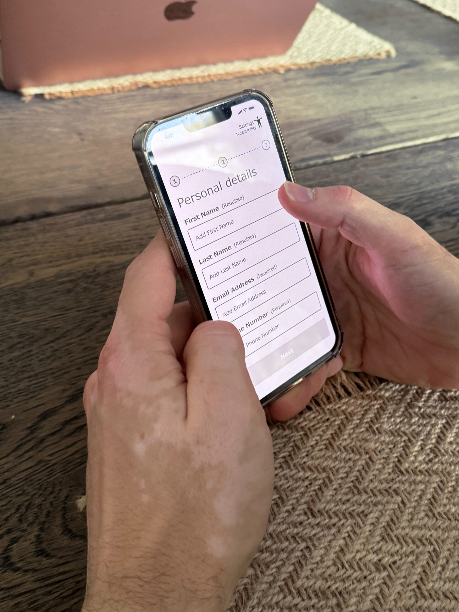
Image slider:
Screenshots from user testing
session of the first prototype.
At the same time, the overall navigation and step-by-step structure were perceived as intuitive, confirming that the core interaction model worked well.
These findings were grouped into themes and translated into concrete design improvements.
Iterations & Refinements
Based on the usability insights, several interface refinements were introduced to improve clarity and accessibility. These refinements simplified the interaction flow and made the interface easier to interpret for older users.
- Reducing cognitive load
Input fields were redesigned to appear progressively. Instead of presenting all fields at once, the interface reveals the next step only after the previous one is completed. This helps users stay focused on a single task. - Improving visibility
Icons and visual indicators were increased in size to ensure they remain readable for users with limited vision. - Minimising visual clutter
Supporting information and help text were hidden until users interact with a specific field, reducing unnecessary visual noise. - Clear completion states
Completed fields now include visible confirmation indicators, helping users understand their progress and preventing uncertainty.
Iteration Annotations
(Mid-fi Prototype)


Outcome & Refined Prototype
The refined prototype introduced several improvements to enhance accessibility and usability:
- Sequential input fields that reveal one step at a time
- Larger icons and clearer visual feedback
- Reduced visual clutter across screens
- Clear confirmation states for completed fields
These changes helped maintain focus and reduced visual overload during tasks such as account creation.

The Impact
By simplifying interaction patterns and prioritising accessibility, the Easylift concept demonstrates how inclusive design can expand access to digital services.
The design supports older adults in navigating technology more confidently while enabling everyday mobility.
The approach also highlights how accessibility-first design improves usability for a broader audience, not only users with impairments.
The Takeaway
Designing for accessibility revealed how small interface decisions — such as layout structure, icon size, and interaction feedback — can significantly affect usability.
The project reinforced the importance of iterative testing when designing for diverse user groups.
Next steps would include:
- Integrating map and route functionality.
- Conducting usability tests with elderly participants.
- Expanding accessibility testing across devices and screen readers.
- Developing the ride-matching flow and booking confirmation.