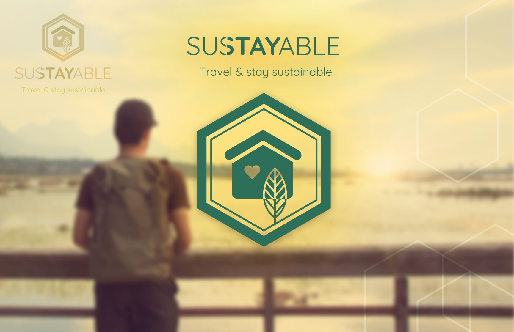
The Sustayable App.
Travel & stay sustainable
THE CASE AT A GLANCE
A mobile booking concept helping travellers choose lower-impact trips through staycation.
Sustayable is a concept app for planning lower-impact trips, combining travel inspiration, transport options, and environmental impact comparisons in one place.
This concept was developed during a four-week UX program project, exploring how design can make sustainable travel choices clearer and easier to compare
UX Research · Inclusive Design · Accessibility · Service Strategy · Sustainability
PROJECT
The Sustayable App – Travel & stay sustainable.
CONTEXT
UX Program Sprint Project
SECTOR
Travel Tech · Sustainability · Accessibility
CHALLENGE
Sustainable travel options are difficult to find on mainstream booking platforms.
MY ROLE
UX Strategy & UI Designer
FOCUS
UX · User Research · Accessibility · Concept Development
TIMELINE
4 weeks
TOOLS
Figma · Figjam · Miro · Adobe Creative Suite
MY ROLE
UX Designer
- Led research synthesis & defined core problem
- Designed end-to-end booking flow
- Built and tested interactive prototypes
- Translated insights into refined design decisions
UI/Visual Designer
- Created brand name & logotype
- Defined visual direction & hierarchy
- Designed clear, accessible interface layouts
- Refined UI details & microcopy
Challenge & Research
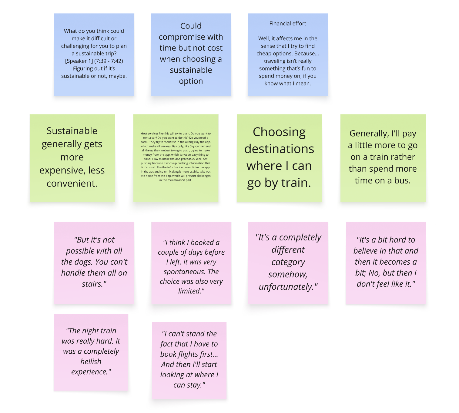
Travellers trying to reduce their environmental impact often struggle to find clear information. Transport, accommodation, and emissions data are scattered across platforms, making options hard to compare.
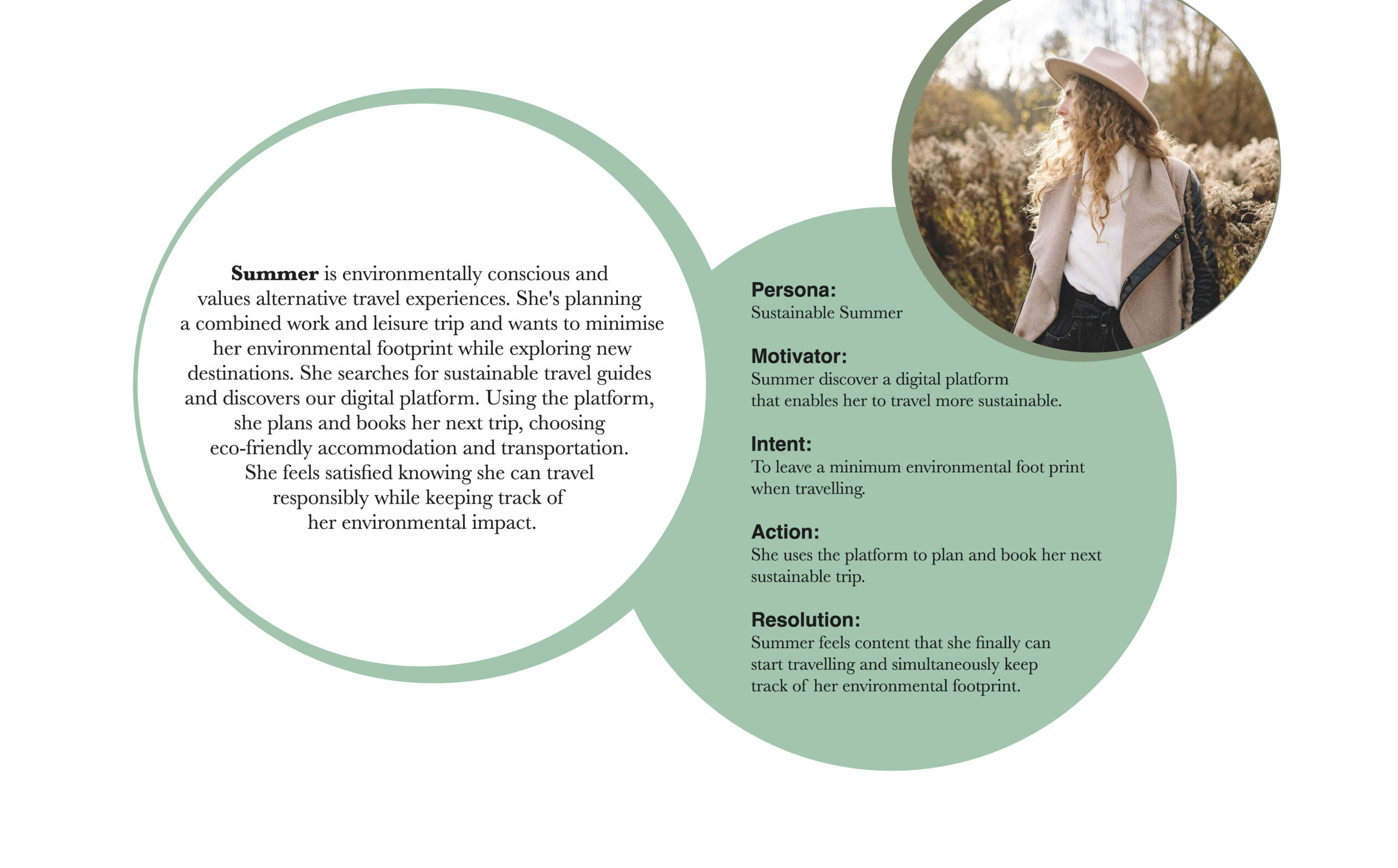
We interviewed travellers to understand how sustainability influences travel planning. These insights informed a sustainability-motivated persona.
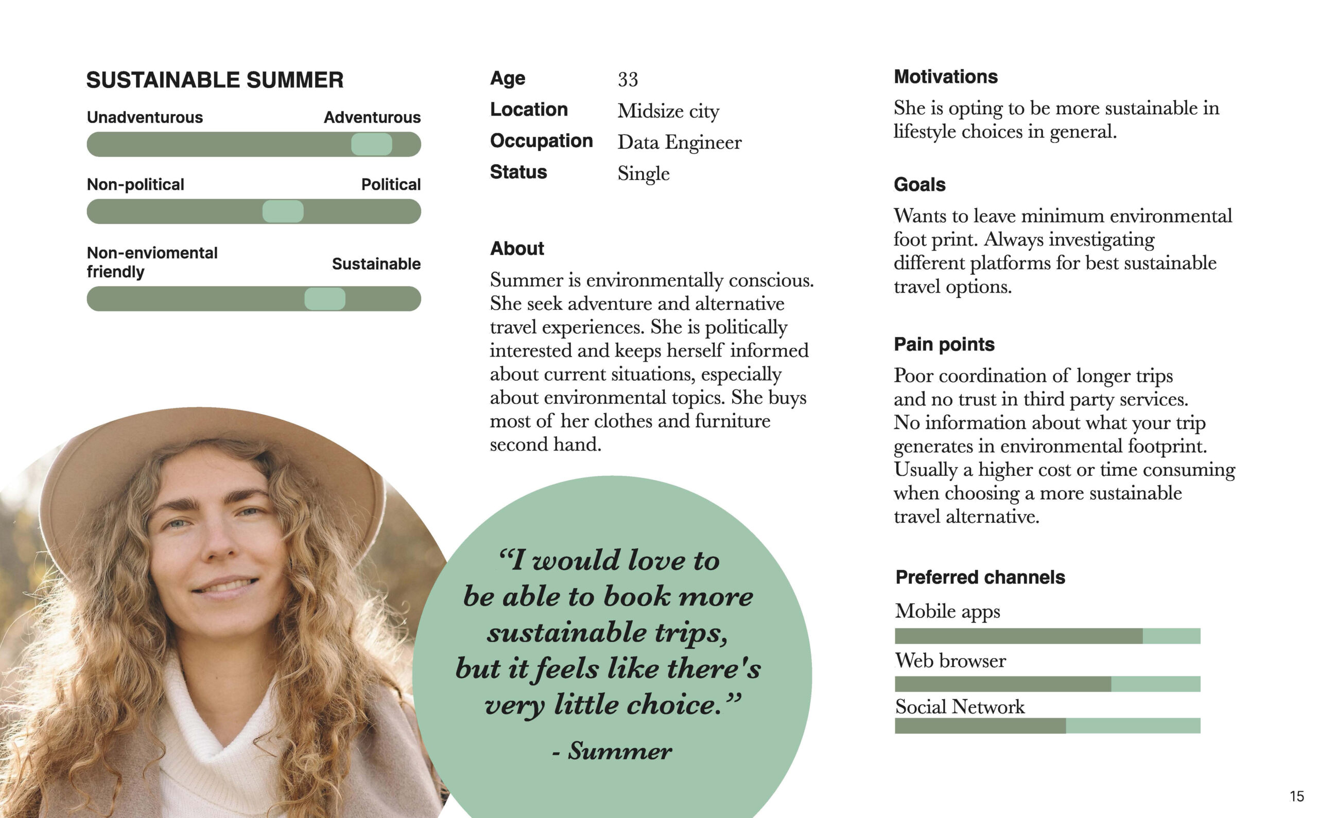
Key Insights
Research revealed friction points preventing users from booking sustainably:
- Identification: Sustainable options are difficult to find and verify.
- Perception: Eco-friendly alternatives are viewed as expensive or inconvenient.
- Fragmentation: No centralized platform combines transport, stays, and emissions data.
- Friction: Convenience often outweighs sustainability during the actual booking moment.
These insights revealed a gap between travellers’ intentions and the tools supporting sustainable choices.
Core Insight
A core insight emerged:
the barrier is not lack of awareness — sustainable travel is simply harder to choose.
This made us pose a couple of HMV-questions with the top one being:
“How might we make sustainable travel options feel equally convenient, transparent, and viable for all travellers — not just the already committed?”
Concept
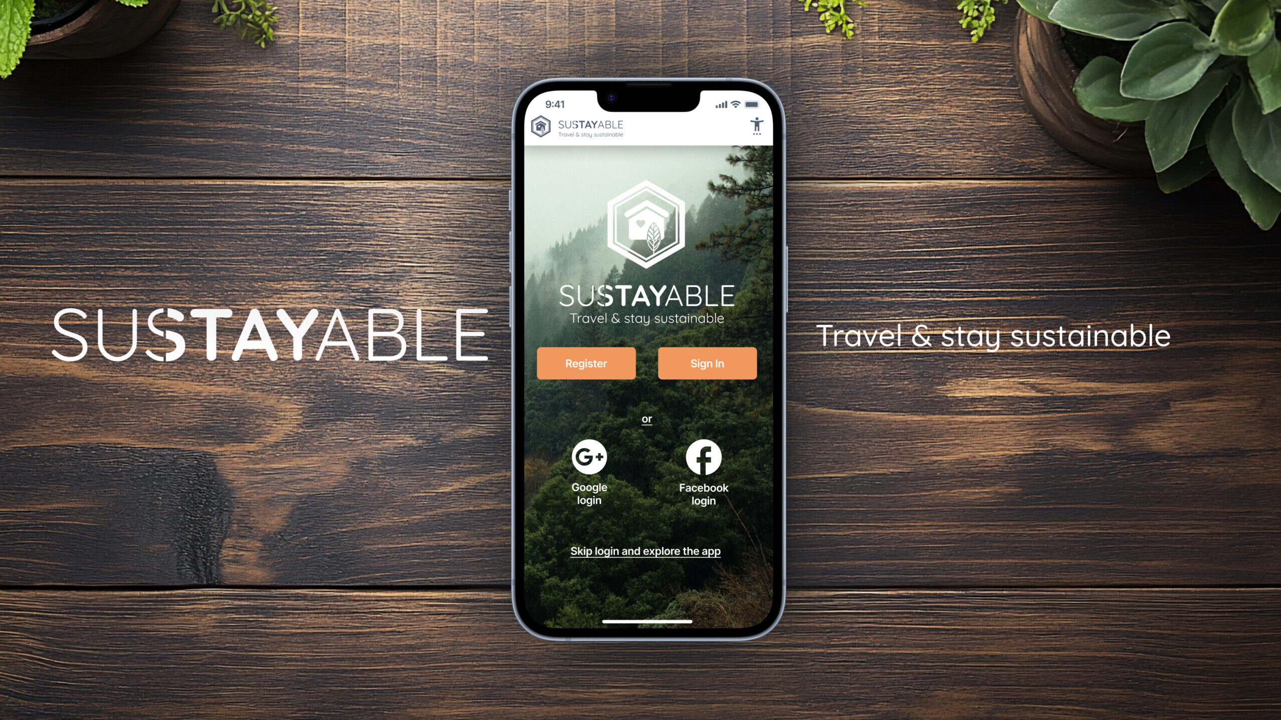
Sustayable – Travel & stay sustainable
The Sustayable concept “Travel and Stay Sustainable” encourages staycation through eco-friendly travel and accommodation packages in Sweden. It offers inspirational trip recommendations and serves as a pilot adaptable to any country.
Sustayable combines curated staycation packages with a transport planner highlighting lower-impact routes.
Instead of persuading users to travel sustainably, the design makes lower-impact options easier to understand and compare during booking.
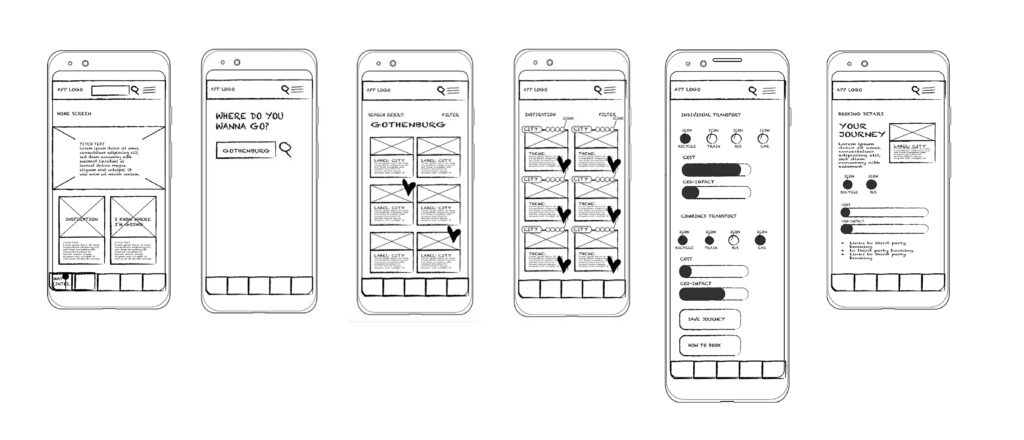
Prototype & Usability Testing
We created a mid-fidelity prototype for the core journey:
Discover → Review Impact → Plan Transport → Save.
Three moderated usability tests evaluated navigation and trust. The feedback was clear: users reject complexity more than they reject sustainability.

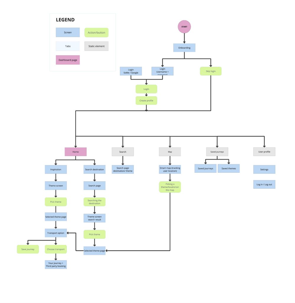
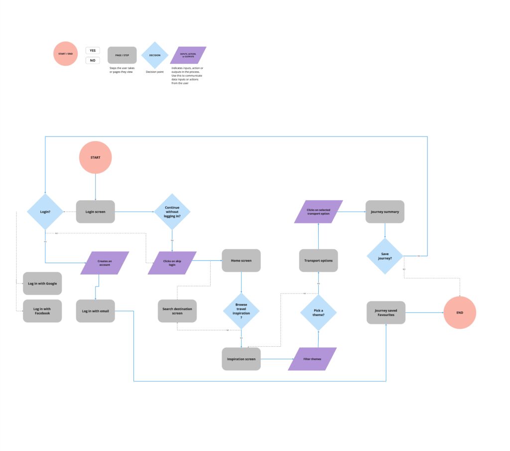
Information Architecture & User flow


Findings & Iterations
After testing, we collected issues and improvement suggestions from each session. We grouped findings into themes, generated insights, and identified design improvements.
User feedback directly informed interface refinements, particularly around the filter structure and the clarity of emission information. These insights helped us prioritise the most impactful usability improvements.
Based on the findings from testing and the patterns observed across sessions, we implemented three key design iterations.


Building Trust: Integrated reviews and “trust signals” to validate sustainable claims, as users were skeptical of “green” labels alone.
Simplified Visualization: Reduced the size of emission graphics to prevent “data overwhelm” and keep the focus on the travel experience.
Clarity over Buzzwords: Refined button copy and filtering to be more intuitive for non-expert users.
Iteration Annotations
(Mid-fi Prototype)


Outcome & Refined Prototype
The final concept integrates sustainability directly into the travel planning process.
Travellers can explore trips, compare transport options, and see their environmental impact within a single interface.
The Impact
Integrating sustainability into the booking flow reduces decision friction and makes sustainable options easier to evaluate.
The design:
- reduces decision fatigue through clear comparison
- uses emission data as a subtle nudge guiding the user
- positions sustainable options as a viable default
The Takeaway
Sustainability fails at the decision moment, not the awareness stage.
Travellers often want to make more responsible choices, but when information is fragmented or difficult to interpret, convenience tends to win.
Reducing cognitive friction matters more than persuasion.
Users rejected complexity more strongly than sustainability itself. Integrating transport options, accommodation, and environmental impact in one flow helped make sustainable alternatives easier to evaluate.
Interface hierarchy subtly shapes behaviour.
Clear comparisons and restrained impact visualisation allowed environmental information to guide decisions without overwhelming the user.

Next Steps
- conduct accessibility testing
- broader usability testing
- refine emission visualisations
- integrate booking APIs