VA SYD.
My Pages in App
THE CASE AT A GLANCE
VA SYD, is one of Sweden’s largest regional water and waste utilities, serving southwestern Skåne. The concept reimagined VA SYDs app as a personal service hub, creating a seamless mobile experience that makes everyday water and waste services simple to manage – all built into their mobile app.
Working as part of a UX design team, we ensured VA SYD’s critical community service met all legal accessibility requirements.
This project was completed as the capstone assignment of my UX design program in collaboration with VA SYD.
UX/UI Design · Accessibility-focused UX Research
CLIENT
VA SYD, one of Sweden’s largest regional water and waste utilities, serving southwestern Skåne.
PROJECT
VA SYD App – E-services integration
CONTEXT
UX Program Exam Project
SECTOR
Public utilities / Municipal services
CHALLENGE
The existing app only delivered notifications while all self-service tasks redirected users to a web portal, breaking the mobile experience.
MY ROLE
UX/UI Designer & Accessibility Lead
FOCUS
Mobile self-service · information architecture · accessibility · usability testing
TIMELINE
5 weeks
TOOLS
Figma · Figjam · Miro · Adobe Creative Suite · WCAG evaluation tools
MY ROLE
UX Designer
- Led research synthesis and defined the core problem
- Designed the end-to-end IA and user flow for onboarding and recovery tracking
- Created wireframes and interactive prototypes
- Translated usability insights into iterative design improvements
UI/Visual Designer
- Branding & logotype design
- Defined visual hierarchy and accessibility principles
- Designed clear, readable interface grids & layouts in Figma
- Refined interaction feedback and microcopy
- Ensured visual elements supported usability and accessibility
The Challenge
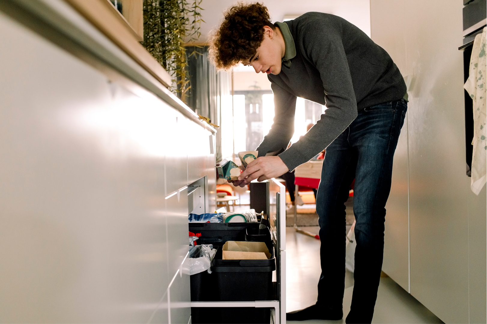
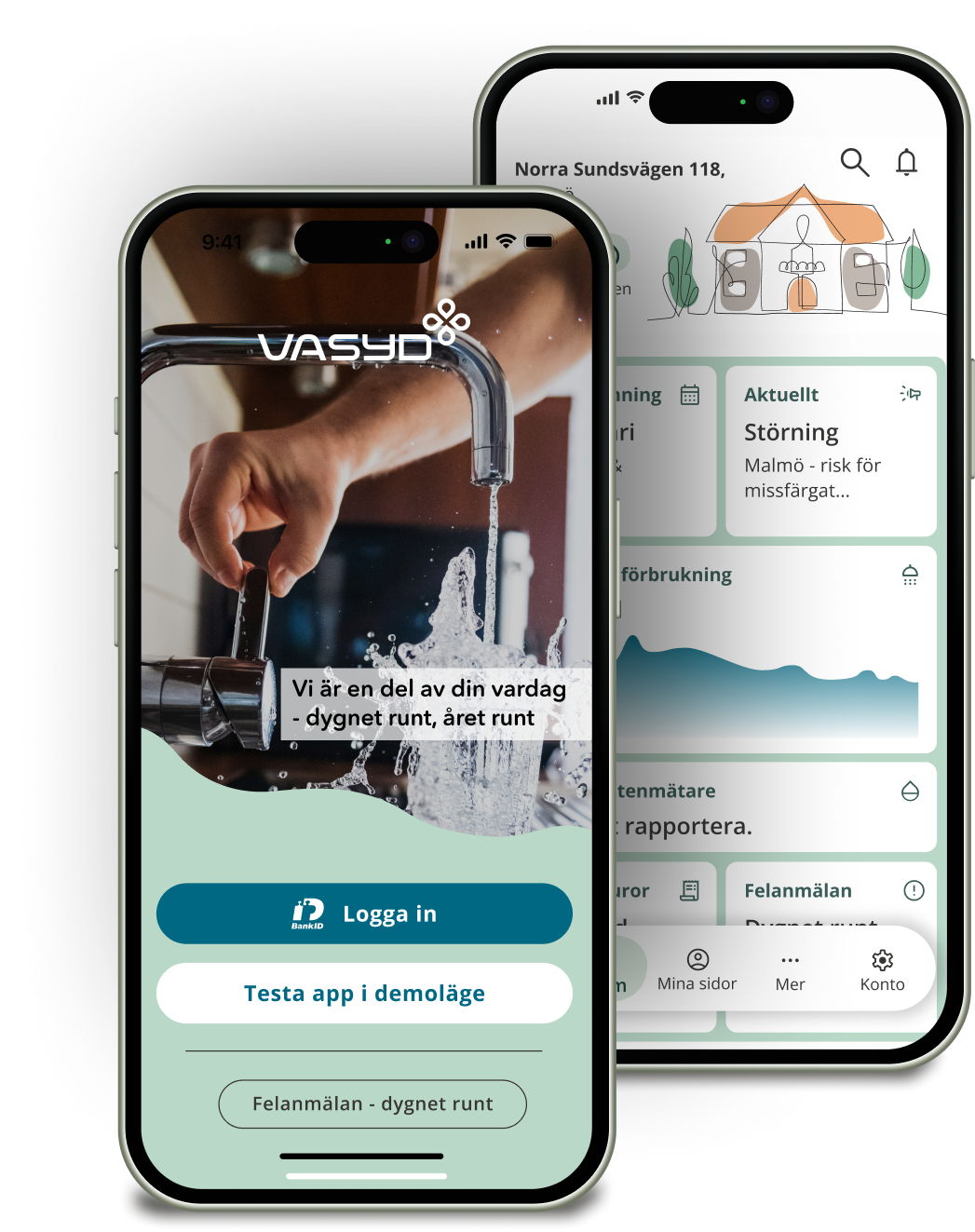
VA SYD provides water and waste services to municipalities in southern Sweden. Customers managing subscriptions or maintenance requests must leave the app and log into the My Pages web portal. This fragmented experience creates friction and makes the app feel limited.
The project explored how VA SYD’s existing e-services could be integrated into a mobile interface and whether customers would prefer managing services directly within an app.
The goal was to design a mobile experience that allowed users to access information, perform self-service tasks, and receive relevant updates within a single platform.


Image slider showing the first sketch and finished prototype of the app’s home screen.
Research
To understand the problem space, research combined stakeholder interviews with benchmarking and exploratory user research. A SWOT analysis was conducted to examine how similar service apps structure information and self-service functionality.
The research examined how customers interact with municipal service platforms and what they expect when managing services digitally.
Insights from this phase informed the personas, problem framing, and concept development.

Understanding the users
Research insights revealed two main customer groups interacting with VA SYD’s services. To better represent their needs and behaviors, we created personas that capture typical service interactions and expectations.

Key insights
Through the research three main patterns emerged:
- Users rarely interact with the service unless something goes wrong
- When problems occur, users expect fast access to clear information
- Too much information quickly overwhelms users in service apps
The core insight: the issue was not lack of functionality — it was fragmentation. The design opportunity therefore became clear: turn the app into a complete self-service platform rather than a notification channel.
CORE INSIGHT: FRAGMENTATION
Users expected to complete tasks directly in the app, but the current experience redirected them to the web portal. This broke the interaction flow and increased cognitive friction.
How Might We Questions
Based on the research insights, we reframed the problem into design opportunities to helped focus the concept development:
- How might we make it easier for customers to perform services digitally?
- How might we deliver relevant information to different customer groups?
- How might we turn VA SYD’s service data into meaningful value for users?
Ideation
To explore potential solutions, several ideation techniques were used, including reverse brainstorming.
Instead of asking how to improve the app, we explored what would make users avoid it. This exercise helped identify barriers such as unclear navigation, lack of personal relevance, and poor accessibility.
These insights guided the design priorities:
- accessible design patterns
- personalisation
- simplified navigation
- clear service entry points


Concept
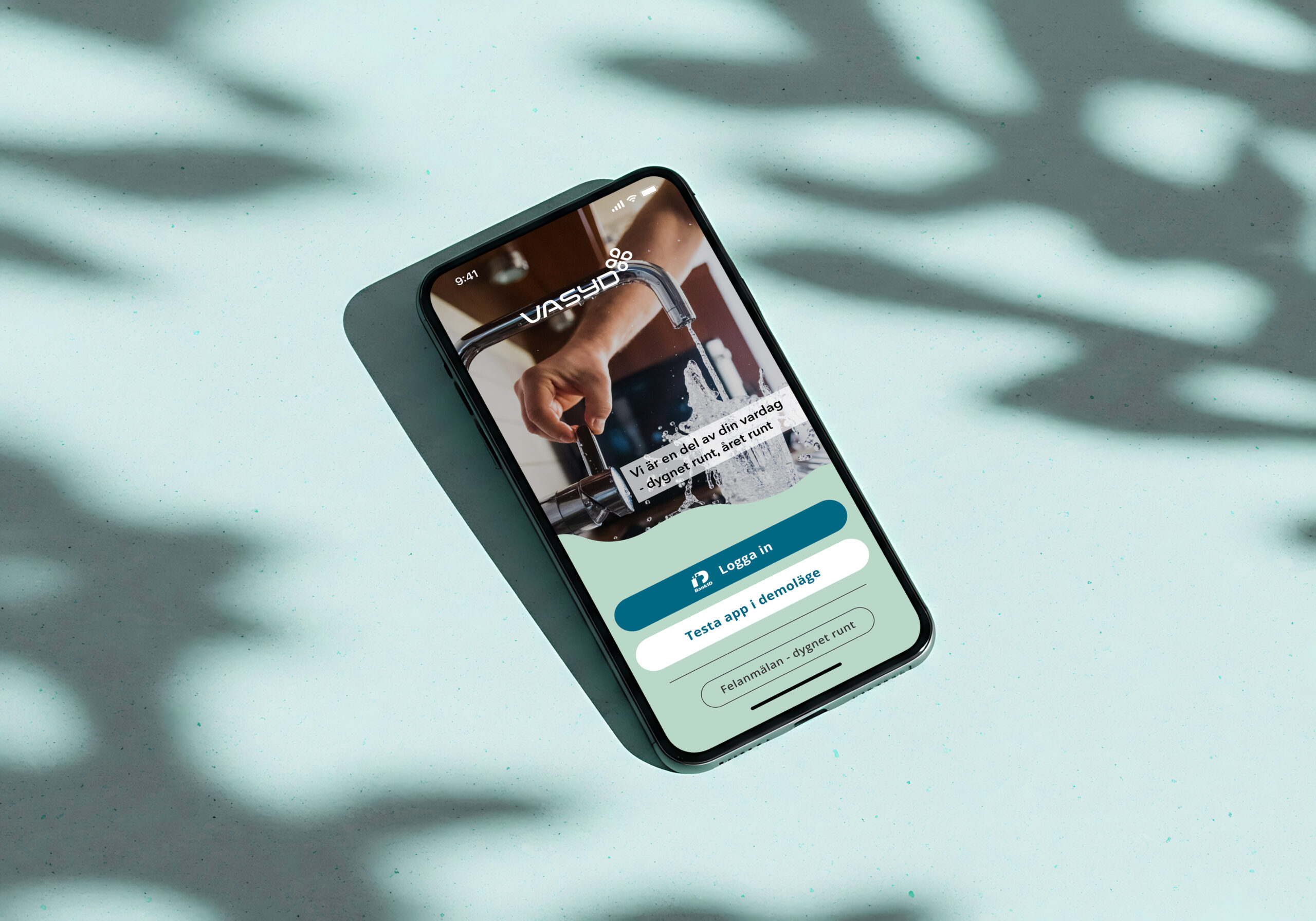
The final concept reimagined the app as a personal service hub.
Instead of static information pages, the home screen uses customizable widgets that surface relevant information such as:
- next waste collection
- current water usage
- unpaid invoices
- operational alerts
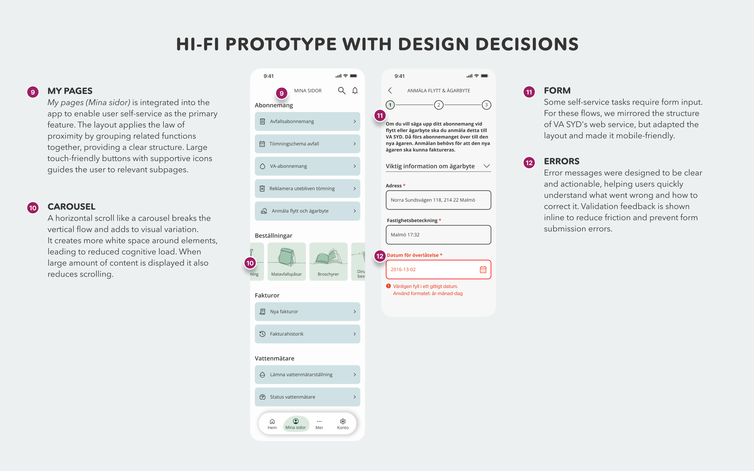
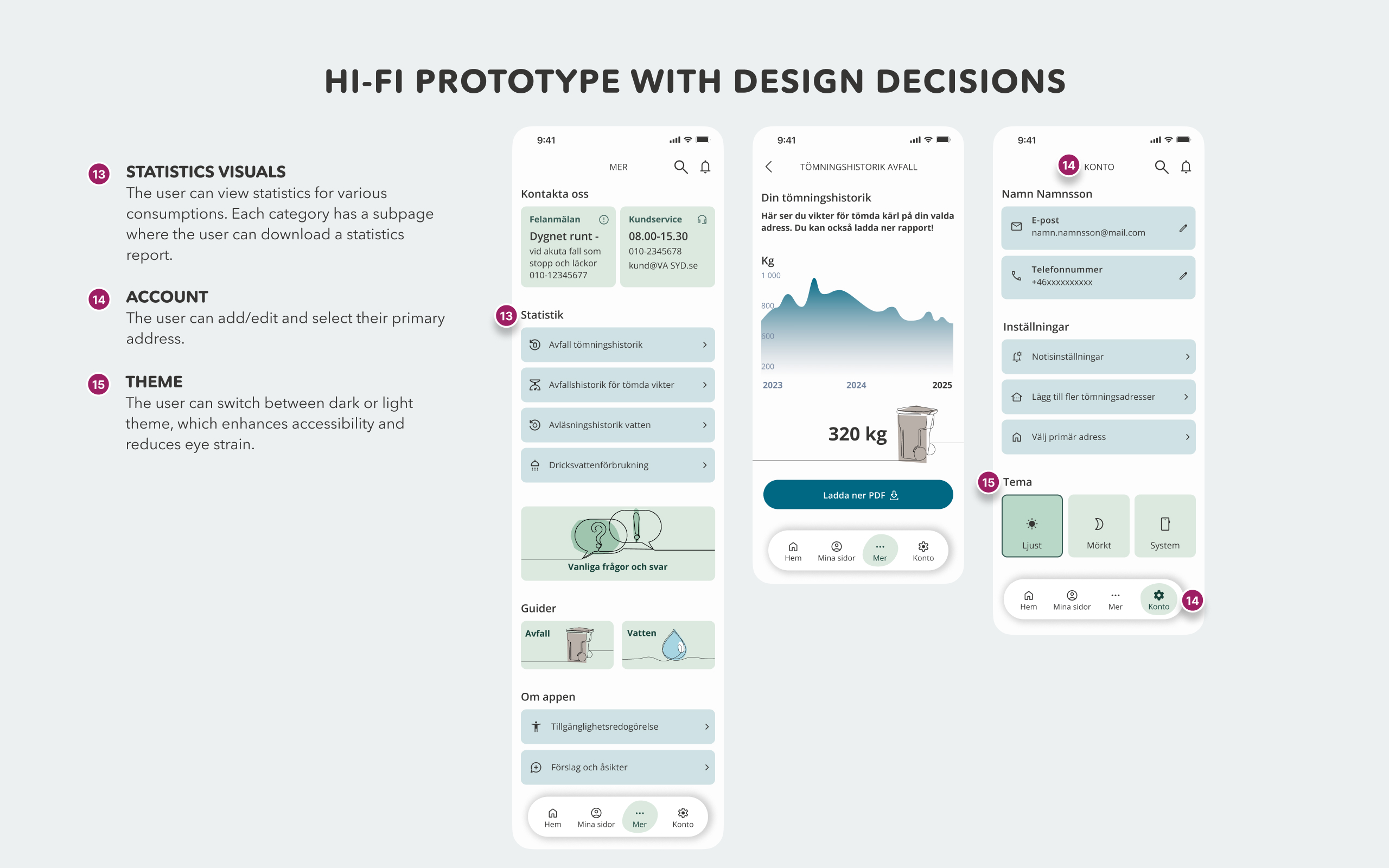
This approach allows users to tailor the interface to their needs while keeping the layout lightweight and easy to scan. The concept also integrates VA SYD’s My pages directly into the app, enabling users to perform tasks such as:
- reviewing statistics
- managing subscriptions
- submitting service requests
- reporting issues

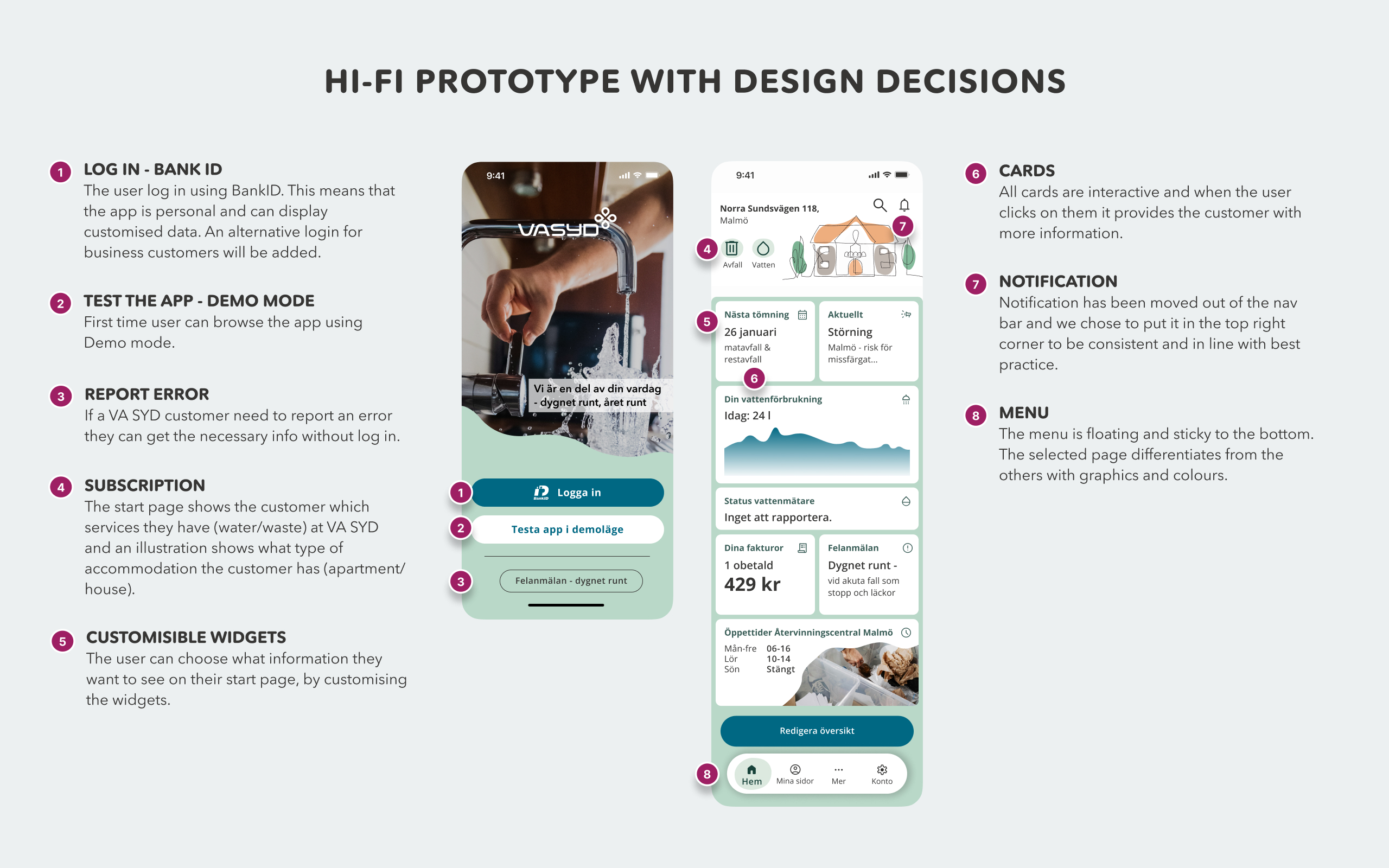
Design decisions
These decisions defined the visual and structural direction of the hi-fi prototype. They address everything from small graphic decisions to information hierarchy, this to support clarity and accessibility, while balancing VA SYD’s established identity with a refreshed app-specific design system.
Design decisions included:
- using the organisation’s existing typeface to maintain recognisability
- refining the colour palette for digital readability
- incorporating one-line illustrations to create a friendlier visual tone
The overall design emphasises clarity and calmness, reflecting the nature of public utility services.


Color palette for light mode.

Accessibility
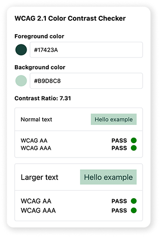
VA SYD is a public utility; therefore it must comply with the Digital Accessibility Act (DOS-lagen/WCAG 2.1/2.2). Accessibility was treated as a foundational design principle rather than a final adjustment. The solution was aligned with WCAG 2.2, addressing areas such as:
- colour contrast
- keyboard navigation
- error messaging
- form validation
- focus visibility
We also tested colour combinations for accessibility adherence and simulations were conducted to ensure readability for users with colour-vision deficiencies.


Prototype & Usability Testing
The design process included two rounds of usability testing. The first round used a paper prototype, allowing rapid exploration of navigation and information architecture.
Participants were asked to complete tasks such as:
- reporting a change of address
- finding service statistics
- navigating account settings


The second round tested a high-fidelity interactive prototype remotely with moderated sessions.
Metrics included:
- task completion time
- error rates
- satisfaction ratings
Each session lasted approximately 20 minutes and used think-aloud methodology to capture insights into user reasoning.
Excerpt from Sentiment analysis


Findings
Testing revealed several consistent patterns:
- Users quickly understood the overall navigation and structure.
- Customisable widgets were especially appreciated and encouraged exploration.
- Participants also confirmed that integrating e-services into the app significantly improved the experience compared to using the web portal.
- One notable finding was that users expected statistics and service information to be grouped with their personal subscriptions rather than placed in separate sections.
Iterations & Refinements
Based on testing insights, several adjustments were implemented:
- moving statistics under My pages
- simplifying service terminology
- improving form validation feedback
- increasing visibility of urgent service information
- Navigation labels were also adjusted to better match users’ mental models, reducing confusion around service categories.
Outcome & Impact
The redesigned concept shows how VA SYD’s app could evolve from a notification tool into a comprehensive customer interface.
Key improvements include:
- a unified platform for information and services
- reduced friction in task completion
- clearer information hierarchy
- improved accessibility
The concept also supports future expansion by allowing new services to be added through modular widgets and structured navigation.
The Takeaway
This project highlighted the importance of designing public-service interfaces around real user behavior rather than organizational structure. The new version is designed with accessibility in mind, simplifying information so that it works for all citizens regardless of digital habits. This reduces the pressure on customer service and saves money for the organization.
Municipal services can often be a bit anonymous until problems arise. When users do interact with them, the experience must be immediate, clear, and reliable. By focusing on personal relevance, accessibility, and seamless service access, the redesigned app creates a foundation for a more user-centered digital service.
A side by side comparison of the current Start page for the VA SYD’s app (1) and the suggested Start page for our hi-fi prototype (2):

